Template 4 content types
As you start to create and edit your web pages, you'll discover that each page in Cascade is a collection of content types (known as "components"), each designed to hold a certain type of content.
Many of these components are available for you to add directly to a page, but some of them are intended for specific uses, and require admin access to add them to your page or site.
Images
When uploading new images to your page, be sure to note the required size for the image component you'll be using.
You should crop and resize your image to the correct dimensions, and compress the size of the image file before uploading to Cascade.
Content main image
- Required size: 1440x810 pixels
- Usage: Content page

Other image content types
- Card grid with image
- Hero image (for strategic landing pages)
- Full-width card (for strategic landing pages)
- Jumbotron (standard landing pages)
- Overlay card
- Promo card
- Photo gallery
Text
If you want to create subsections of text, you can do so with the Text content blocks.
Remember to follow the guidelines around accessible and readable text.
Level 3 heading
- Bullet list item 1
- Bullet list item 2
- Bullet list item 3
Level 4 heading
- Numbered list item 1
- Numbered list item 2
- Numbered list item 3
Level 5 heading
Here's an example of a sentence with an inline link. This is different than adding a button link.
Link classes
These classes add a custom icon to the link to help users understand what to expect when they click.
Buttons
Call-to-action (CTA) buttons
Document buttons
Accordions
Accordions are useful for collapsing long lists of secondary content (information that is non-essential to the main task of the page). E.g. list of committee members.
Accordions should be used sparingly. Avoid using them as a way to shoehorn in long, unwieldy sections of content. Write clear, concise content from outset, and don't hide important information in an accordion.
Note: Accordions can cause usability issues if used incorrectly. Search engines can scan content collapsed inside an accordion and serve it up in a search result, but for the user who clicks on your page, it's not always clear where the content lives, especially if it's hidden inside an accordion block.
Forms
Forms (in-page)
Requires a pre-built HTML form. Contact the Senior Web Officer if you need a custom form built for your site.
- familiarize yourself with the provincial guidelines for collecting personal information online
- in-page web forms should be simple and straightforward
- if you need to use form logic, or want the ability to download submissions as a CSV document, consider using UVic's enterprise form tools SurveyMonkey or Microsoft Forms
Maps
Embedded maps
Cascade supports two types of embedded maps:
- Google maps embed
- Uses the iframe embed code generated by Google Maps
- Must include a title attribute to be accessible. E.g.
title="Fisherman's Wharf on Google Maps"
- Map iFrame (used to embed non-Google maps, e.g. OpenStreetMaps)
Profiles
The profile builder lets you create a listing of all the people in your department.
There are three different layouts you can choose from to display your department's profiles.
- Required photo size: 240x303 pixels
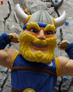
Mascot Vikes
Accepting graduate students
Office: CARSA vicvikes@uvic.ca 250-721-8409
- Area(s) of expertise:
- sports, athletics, recreation, good times
Tables
Tables can be used to display small amounts of tabular data. Tables in Template 4.0 are responsive, meaning on smaller screens multiple columns will resize to a single stacked column.
- Use a properly formatted table header with logical column names
- Group similar data together to save space and increase readability
- E.g. instead of columns for phone number, email and office, group them into a single column called contact
- Content in table cells should be under 300 characters as too much content can reduce the readability of the whole table
When to use tables
Data that might make sense in tables:
- Research data
- Contact listings
- Scheduling information
| Column 1 | Column 2 | Column 3 |
|---|---|---|
| Row 1, Col 1 | Row 1, Col 2 | Row 1, Col 3 |
| Row 2, Col 1 | Row 2, Col 2 | Row 2, Col 3 |
| Row 3, Col 1 | Row 3, Col 2 | Row 3, Col 3 |
Infographics
Infographic cards can be used on persuasive pages (landing or campaign-style) to convey facts and figures in colourful, graphical way.
undergraduate and graduate students
(2023)employees
(2023)Videos
Remember to provide captions, transcripts or descriptive audio for your video to meet accessibility standards.
YouTube
YouTube is the preferred method of embedding video on your Cascade site.
YouTube's video player automatically adapts to the size of the screen it's viewed on, as well as the user's internet or data connection speed.
Echo360
In cases where using YouTube is not an option, you can also embed a video hosted by UVic's video-on-demand (VoD) service, Echo360.
News and events
We can help you set up a feed in Cascade to pull stories from UVic News or events from the UVic events calendar.
Storygrid
A storygrid lets you display a collection of related news stories, events, videos and social (Instagram) posts in one collection of cards.
All of the individual items in a storygrid are updated manually. This means you must edit the storygrid each time you want to add/remove an item. There are no feeds to populate the content automatically.
Image dimensions for storygrid items.

Distinctly UVic

Distinctly UVic

Distinctly UVic

Distinctly UVic
- More..
- News
- Events
- Social media


